
Most design decisions in cars are invisible. Until they ask something from you.
A glance.
A second longer than it should be.
A moment where your eyes don’t immediately understand what they’re seeing.
That’s the space Volvo paid attention to.
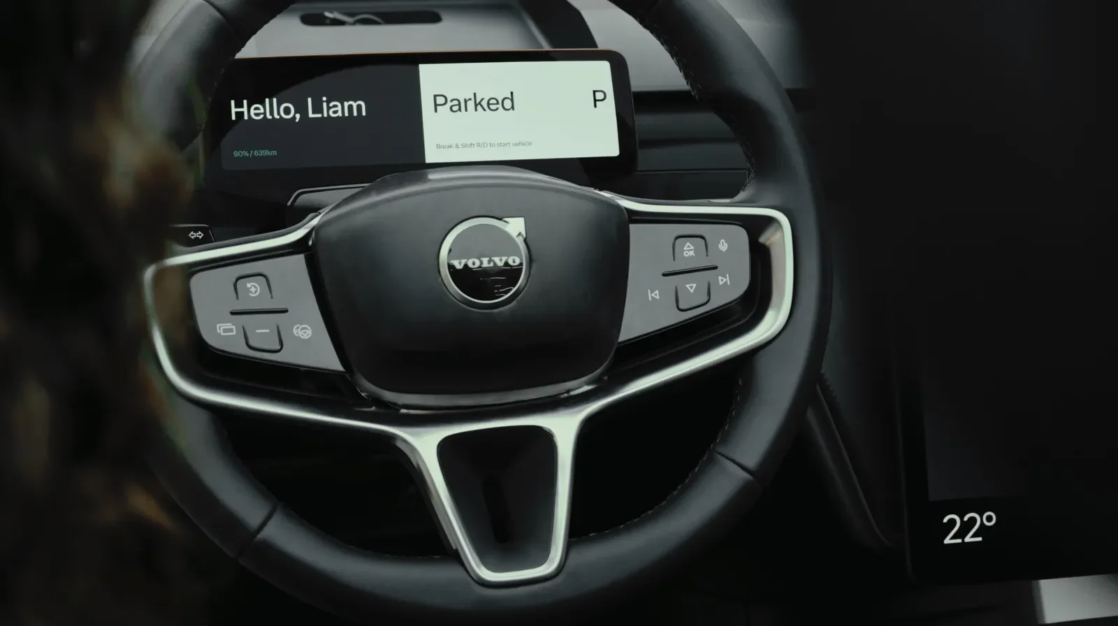
When Volvo Cars introduced its new proprietary typeface, Volvo Centum, it wasn’t framed as a rebrand or a creative refresh. It was framed as a safety decision. That alone tells you where their head was.
The tension we rarely name
We like to believe clarity is obvious.
That if something is readable, it’s readable enough.
But driving doesn’t allow for “enough.”
You don’t read in a car — you sample. You skim. You glance while your attention is already split across speed, movement, sound, and risk.
Every unnecessary curve, cramped letter, or ambiguous shape quietly taxes the brain. Not dramatically. Just enough to matter.
And the danger with small friction is that no one complains about it. They adapt — until adaptation fails.
A different kind of design move
Volvo’s decision to design a custom typeface wasn’t about ownership or distinctiveness. It was about removing micro-decisions from the driver’s mind.
Centum was developed with legibility as the first constraint — how characters separate at a glance, how numbers avoid confusion, how spacing reduces visual noise on screens that are increasingly central to driving.
This wasn’t marketing typography. It was environmental typography — built for motion, varying light, peripheral vision, and stress.
The quiet reframe
Most brands treat typography as voice.
Volvo treated it as behavior.
Instead of asking “How do we sound?”
They asked, “What can we remove so nothing extra is asked of the driver?”
That shift matters. Because the future of cars isn’t fewer screens — it’s more. And more interfaces don’t require louder design. They require calmer ones.
Centum isn’t meant to impress. It’s meant to disappear.
The consequence most people will never notice
If Volvo did this right, no one would talk about the font.
Drivers won’t admire it.
Designers might.
But the real outcome is subtler: eyes return to the road faster. Decisions feel easier. The cabin feels calmer without anyone knowing why.
That’s the paradox of good safety design.
When it works, it doesn’t announce itself.
And maybe that’s the most Volvo move of all.